
03 SIMPLIFYING SEARCH EXPERIENCE - DESKTOP
Summary
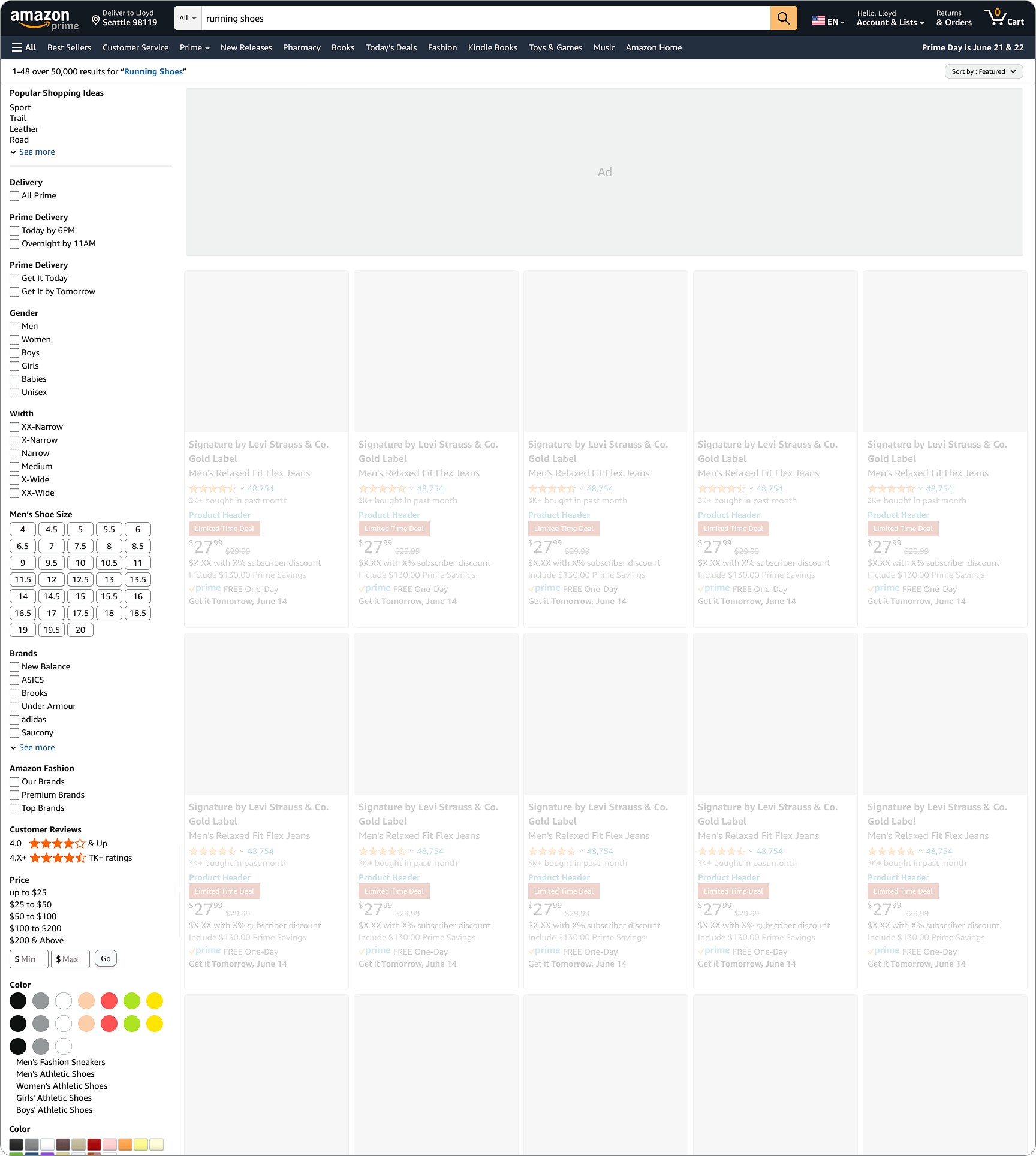
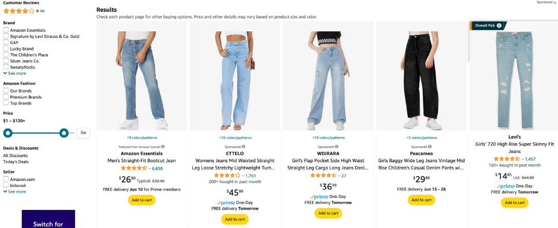
The search results page on Amazon shows a long list of product filters on the left-hand side, which are very detailed and sometimes difficult to understand. To simplify navigation and layout, the goal of this project was to show relevant filters on top of the page in a separate bar to help users access the most relevant filters faster and with less effort.
Customer problem
In one of the research studies conducted, it was discovered that customers found the desktop filter layout overwhelming. Customers that do not use filters complained that the left navigation pane is too long.
Why we were building this
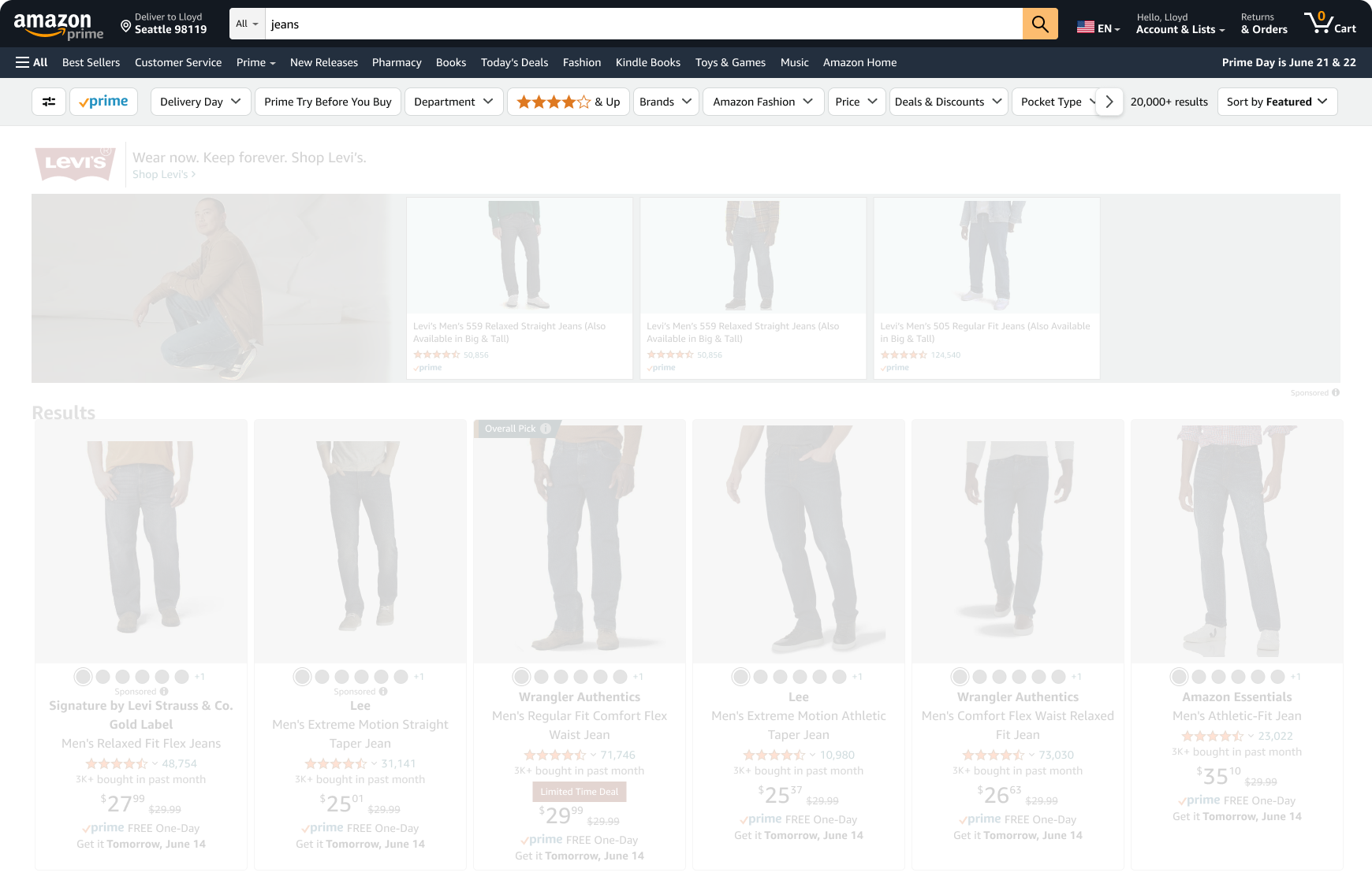
Based on the issues identified in the research study, a cross-functional team comprised of designers, product managers, and engineers wanted to uncover new evidence of how users interact with the search filters. As the lead for search navigation, I proposed a new design with four variations and tested them with users as experiments on the Amazon website. Image below modified to emphasize the relevant part
Impact
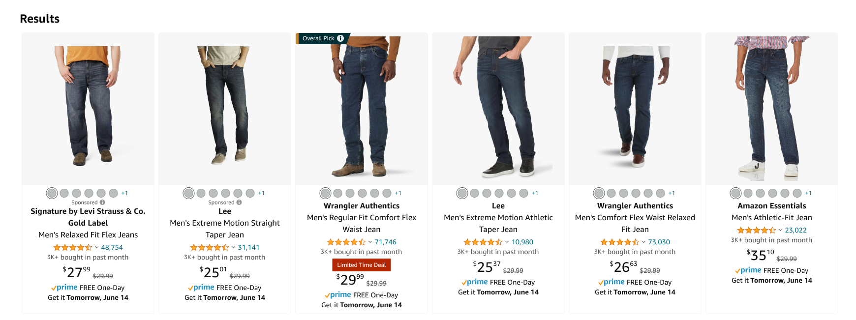
- Balanced UX Goals with Business Revenue: The primary challenge was introducing a top navigation bar without pushing lucrative Ad placements below the fold. By increasing the product grid density (from 5 to 6 items per row), I maintained Ad impression visibility while delivering the desired UI improvements.
- I facilitated cross-functional "bug bashes" to identify edge cases early and partnered with the Accessibility Bar Raisers team to identify keyboard navigation gaps.
- A 4-week live experiment helped to understand while the top-bar layout reduced visual clutter, specific filter interactions required further refinement. We utilized these insights to pivot the V2 strategy, focusing on showing relevant filters and improving dropdown interactions rather than a full redesign.
Initial Challenge
Since I had not worked on this part of the Amazon experience before, I faced multiple challenges while working on this effort. First, I needed to deeply understand the technology. I met with the data scientists to learn how different search models impact the results, ranging from narrow product queries such as “coffee travel mug 24oz,” to broader category queries like “bedroom furniture” and “camping essentials.”
However, bringing about a design change on a page that is so highly visited and so core to the Amazon business is no small feat, and required partnership and collaboration with multiple teams.
My first challenge came when the new design, while hiding the left side filter list, also hid one of the sponsored ads at the bottom of the filter list. Moreover, introducing the results info bar at the top of the page shifted other sponsored ads down by 60px. Since ad placements are bound by the vendor contracts, a design pivot was needed to accommodate them.
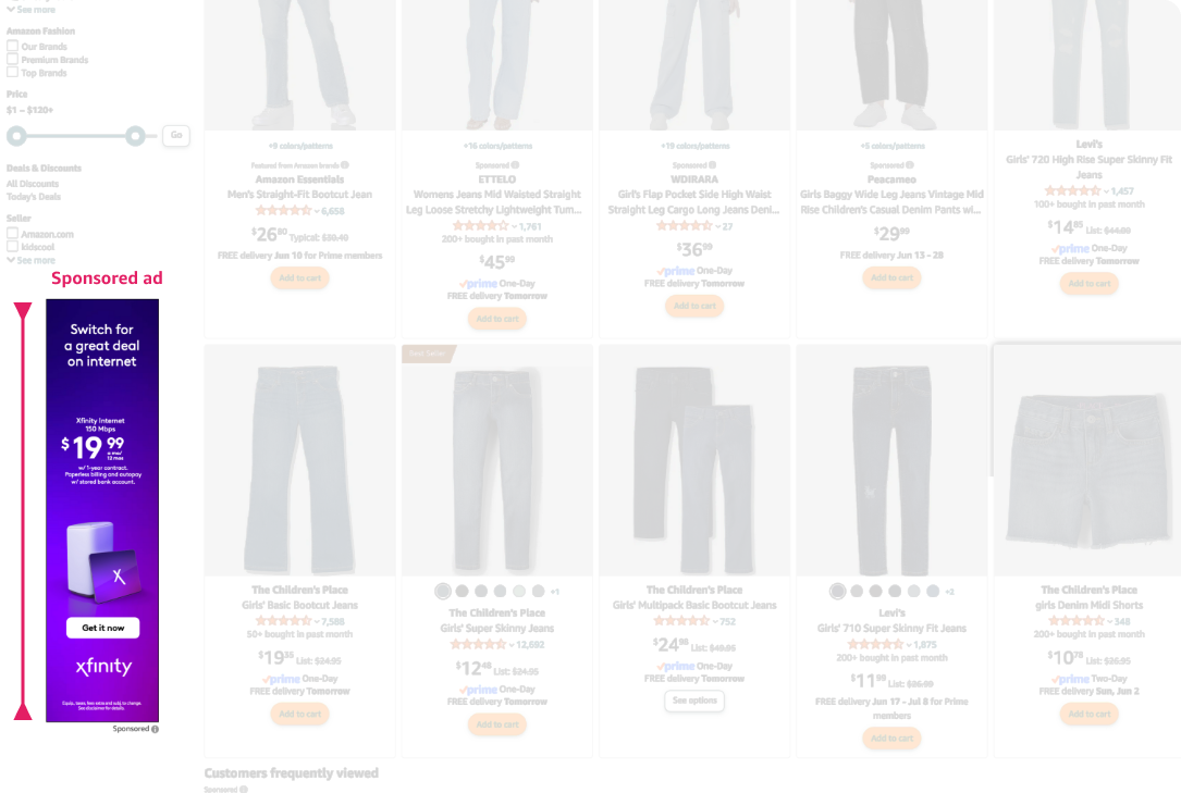
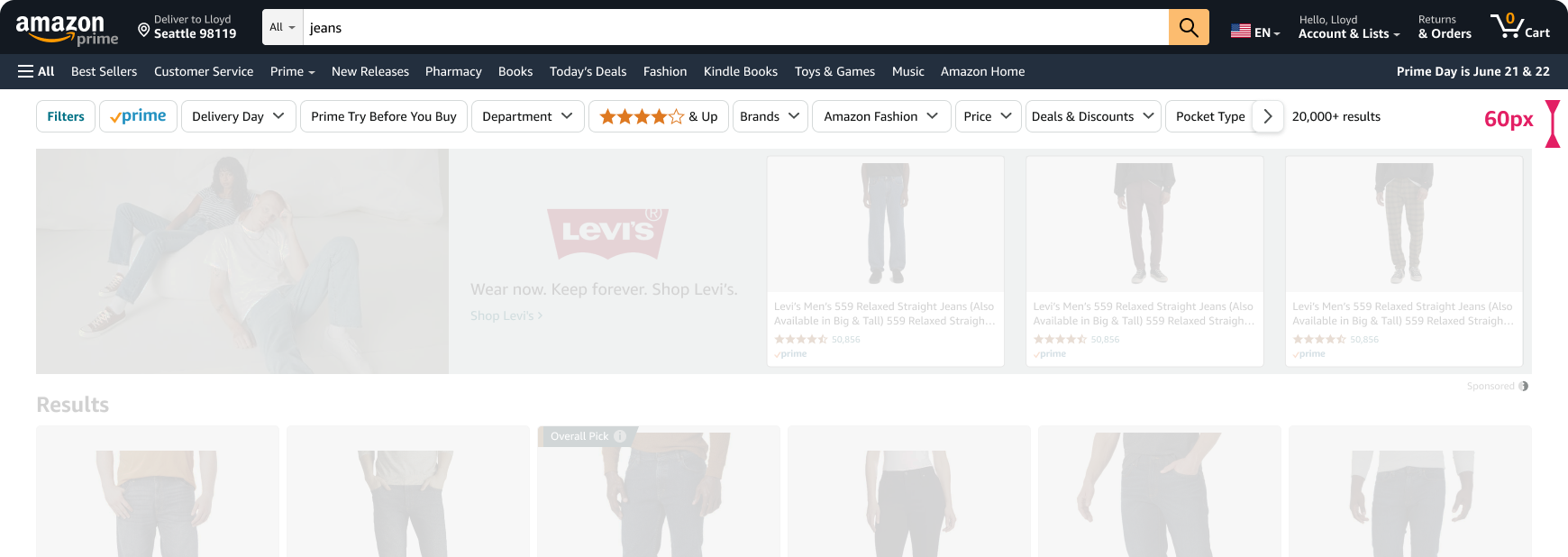
Collaborating with the ads team, I came up with a new ads placement - position and design.

My product partner and I also decided to increase the density of products in each row from five to six, which did not cause much displacement in the position of ads. I quickly iterated on my new design and got it approved by the director of the Ads Team.
Collaborative process
Since the customer experience is very crucial to the search action, I also participated in a lot of bug bashes with the engineering team to make sure the customer experience works as desired. During the session, the team collectively discovered many issues. As the lead designer, I had to provide a lot of design direction on the best ways of dealing with edge cases and error scenarios.
I also needed to make sure that the design continued to adhere to Amazon’s accessibility guidelines. I reviewed the designs with the Accessibility Bar Raisers team. Even though we only identified a few accessibility issues, there were bigger issues with keyboard navigation.
User testing
Finally, after overcoming these hurdles, the team and I were eager to get some live user feedback. I connected with our research team, who then organized a user testing session with eight customers. It was a great learning experience to see the customer search for products live, and understand their mental model and pain points.